
Mirror
Responsive eCommerce website case study
Role - UX/UI Designer, Researcher
Tools - Figma, OptimalSort
Duration - 8 weeks
Deliverables - Responsive website for Mobile and PC
Project Background
Mirror is a clothing store. Mirror started back in 1994 as a clothing store targeting a budget-minded audience. The main goal is to make any clothing with good quality and low prices so that it can be accessible to everyone. Mirror is very successful offline. It has over 400 stores around the world in 32 countries.
Problem
Mirror is very successful offline, but they are very late in the game for a digital transformation. However, the opportunity for sales is huge online, and the behavior is rapidly mainstreaming. Customers have been asking about it for years. Mirror has an outdated logo, and the site, which has to be redone.
Goals And Objectives
Design a logo for the company that is modern and neutral enough to attract all types of people and styles
Design a responsive eCommerce website that is easy to use and that allows customers to browse through all products and filter by size, color, style, and others
EMPATHIZE
My main research goal was to understand customers’ needs and problems when shopping online
Research Methods :
Secondary research to gather and analyze data regarding online shopping
Competitive analysis. Analyze 3 to 5 most significant competitors on the market, their strengths, and weaknesses
Individual interviews. Analyze information about behaviors, personal experiences, and preferences
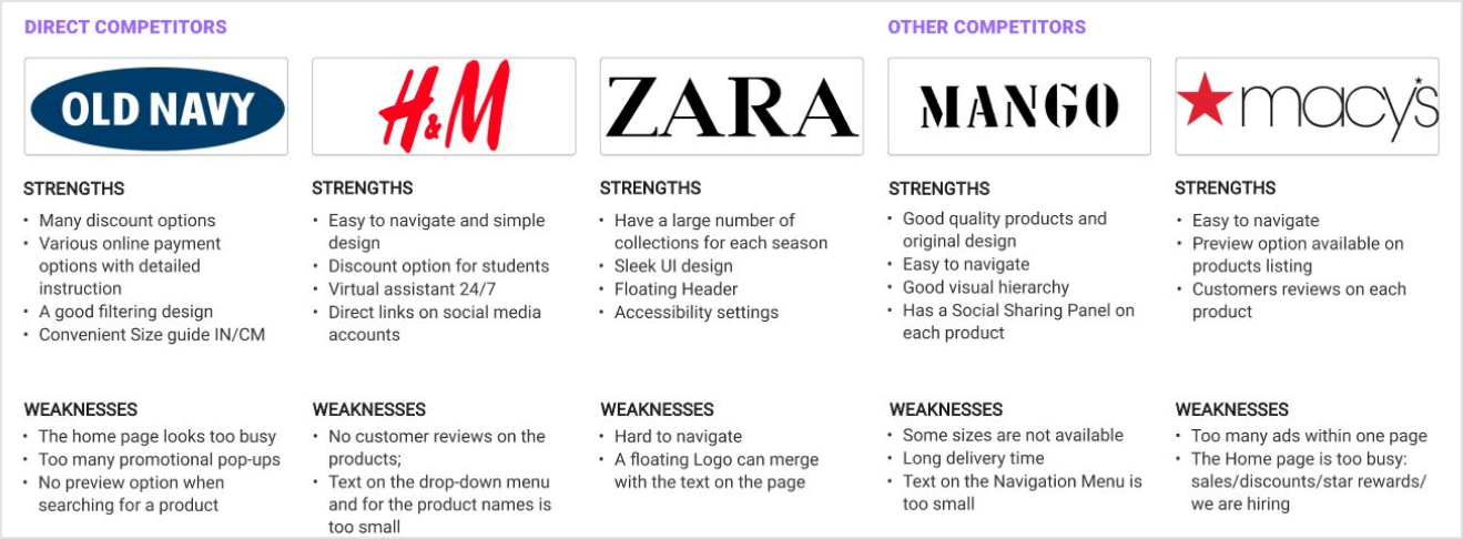
Competitive Analysis. I conducted a competitive analysis to understand the market industry standard and assess other companies’ strengths and weaknesses. The biggest competitors for Mirror are Zara, H&M, and Old Navy. They target the same market and have similar product lines.

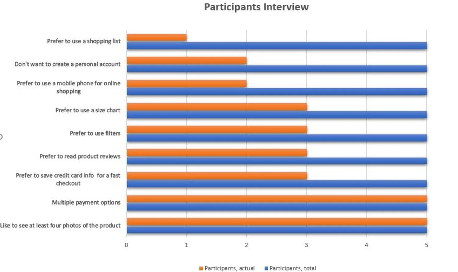
Interview Participants. I conducted user interviews to understand the users' pain points and satisfaction with online shopping. My goals were to learn about their shopping frequency, clothing viewing, and paying preferences. In the research participated two men and three women aged between 21 -50 years old

According to the research, some participants don't have accounts with an online shopping store. It slows down the checkout process.
How to make the checkout process more simple:
allow guest checkout;
let users use their social accounts such as Google and Facebook to register;
provide one step checkout;
make password creation easier for users:
state the password requirements, and make sure that the user can see them the entire time that the field is selected;
allow users to unmask the password
show the strength meters
According to the research, a website should have the following features:
Ability to create an account and save credit card info for the fast checkout process
Ability to use secondary payments methods
Preferred galleries with four images of the product and one video if necessary
Customers’ reviews of the product
Five possible filter categories, for example: “Color,” “Size,” “Price,” “Collection,” “Sorted By and a Size Chart
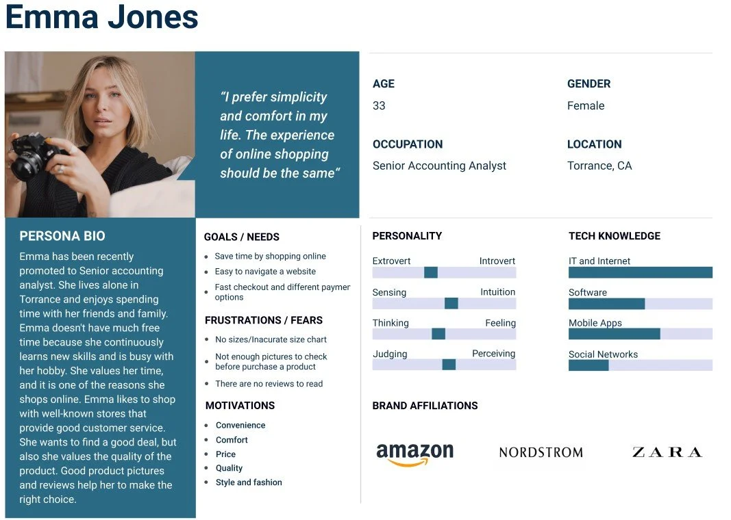
User Persona. After concluding the research, I created a Persona that would best reflect Mirror's target audience

DEFINE
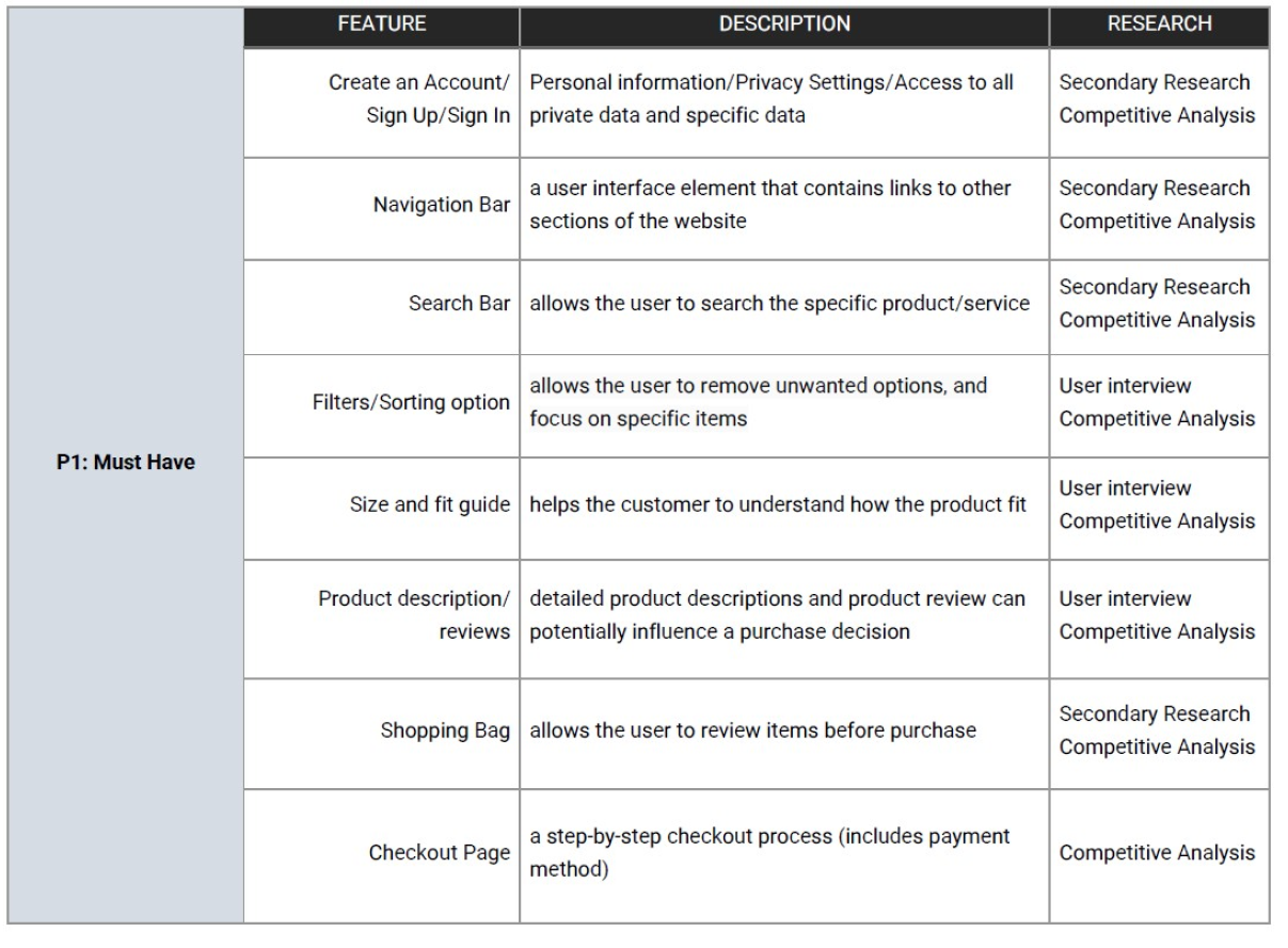
Feature Roadmap
I created a feature roadmap based on my user research findings, the participant's needs, my persona, and competitive analysis

Card Sorting Study. I used Optimal Workshop to create a card sorting activity for participants.
The goal of the study was to understand how participants organize and name apparel products into categories.
Method: Open card sort
Tool: OptimalSort
Cards: 20
Results: Participants created a total of 51 categories; with a median of 8 categories in each
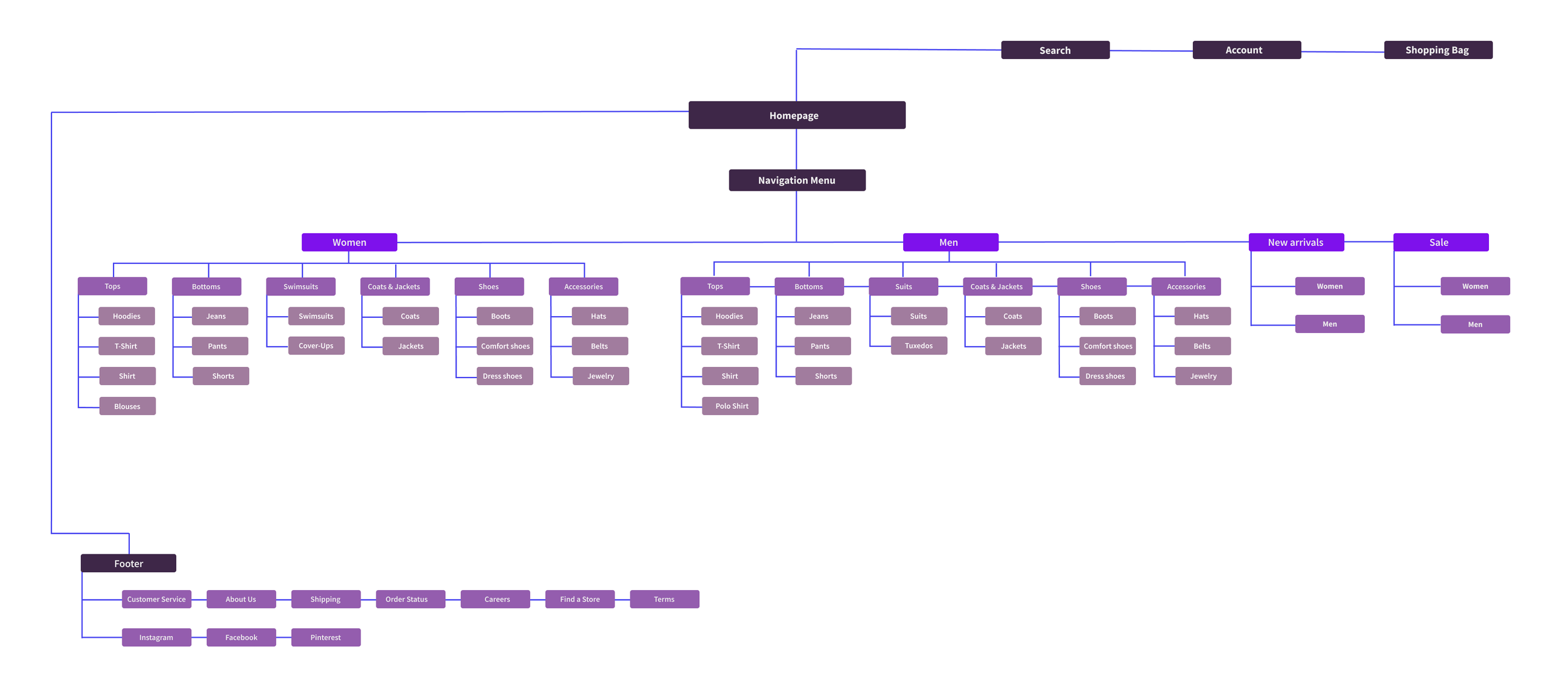
Accessories, with the most common items: jewelry, hats, belts
Tops, with most common: hoodies, polos, t-shirts, shirts, tops
Bottoms, with the most common items: jeans, shorts, leggings, pants
Shoes, with the most common items: sandals, boots, sleepers
Coats and Jackets, only two items: coats and jackets
Dresses, with one item: dresses
Suits, with one item: suits
Swimsuits, with one item: bathing suits
Information Architecture - Sitemap
Based on my findings, I created a sitemap.

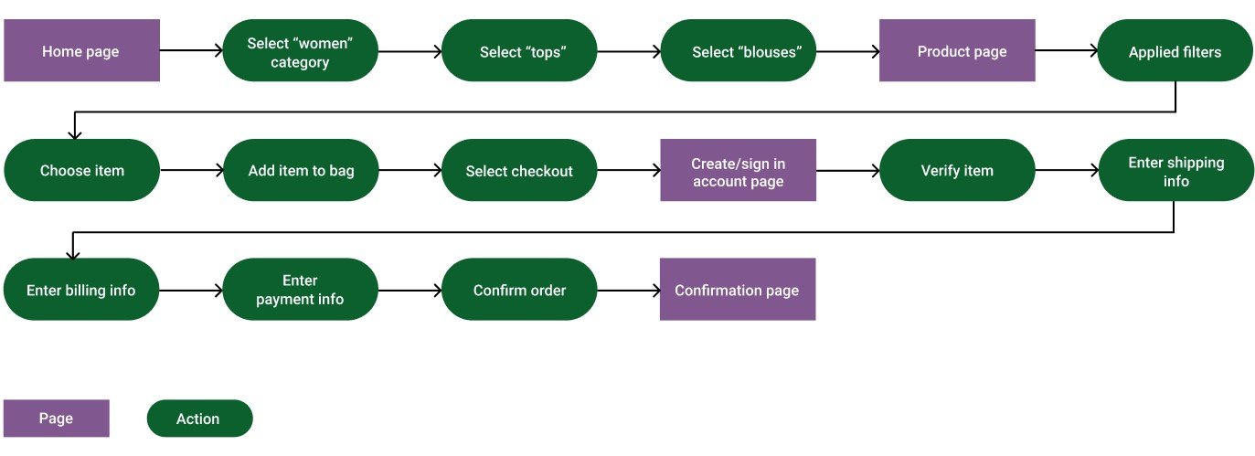
Information Architecture - Task Flow
Task flow: a user wants to find and purchase an item from a women’s section

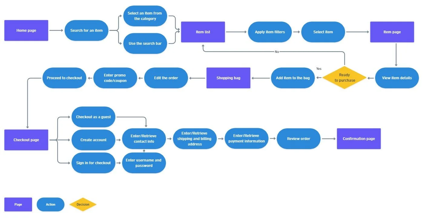
Information Architecture - User Flow

IDEATE
I was ready to begin designing based on my created flows and user research. I started sketching out some design possibilities.


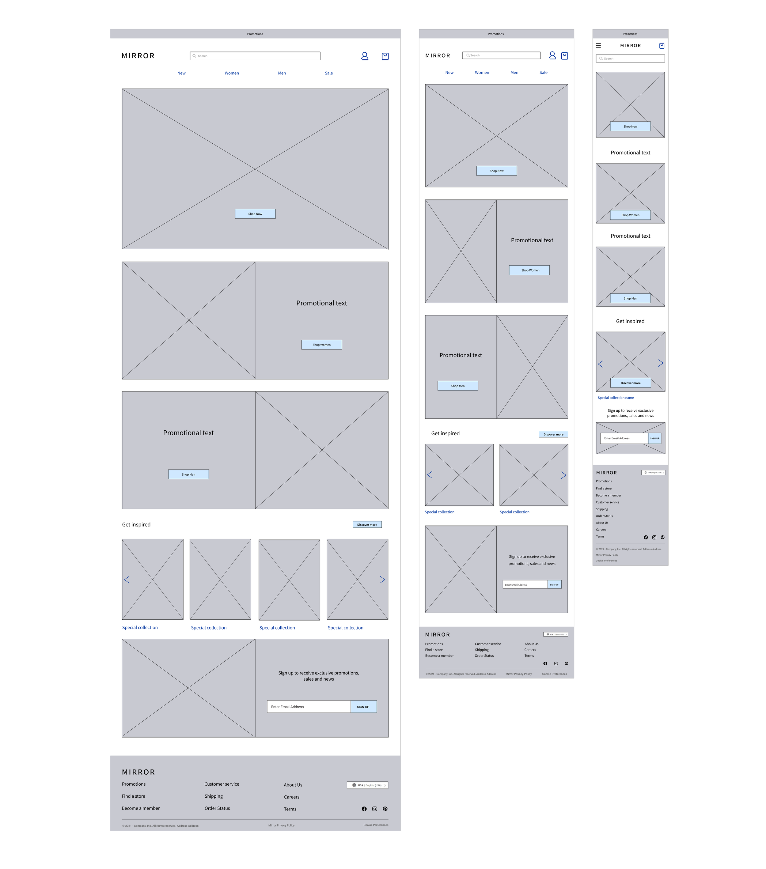
Low Fidelity Wireframes
I translated my sketches into low-fidelity wireframes. When developing the low-fidelity wireframes on a desktop, it was important to consider the mobile design. I followed a grid that would allow for a seamless transition into the tablet and mobile designs.

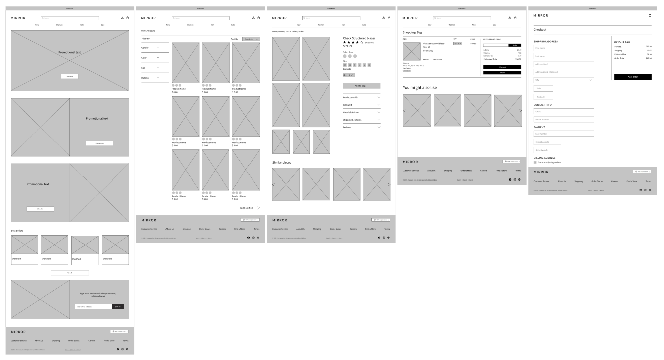
Responsive Wireframes

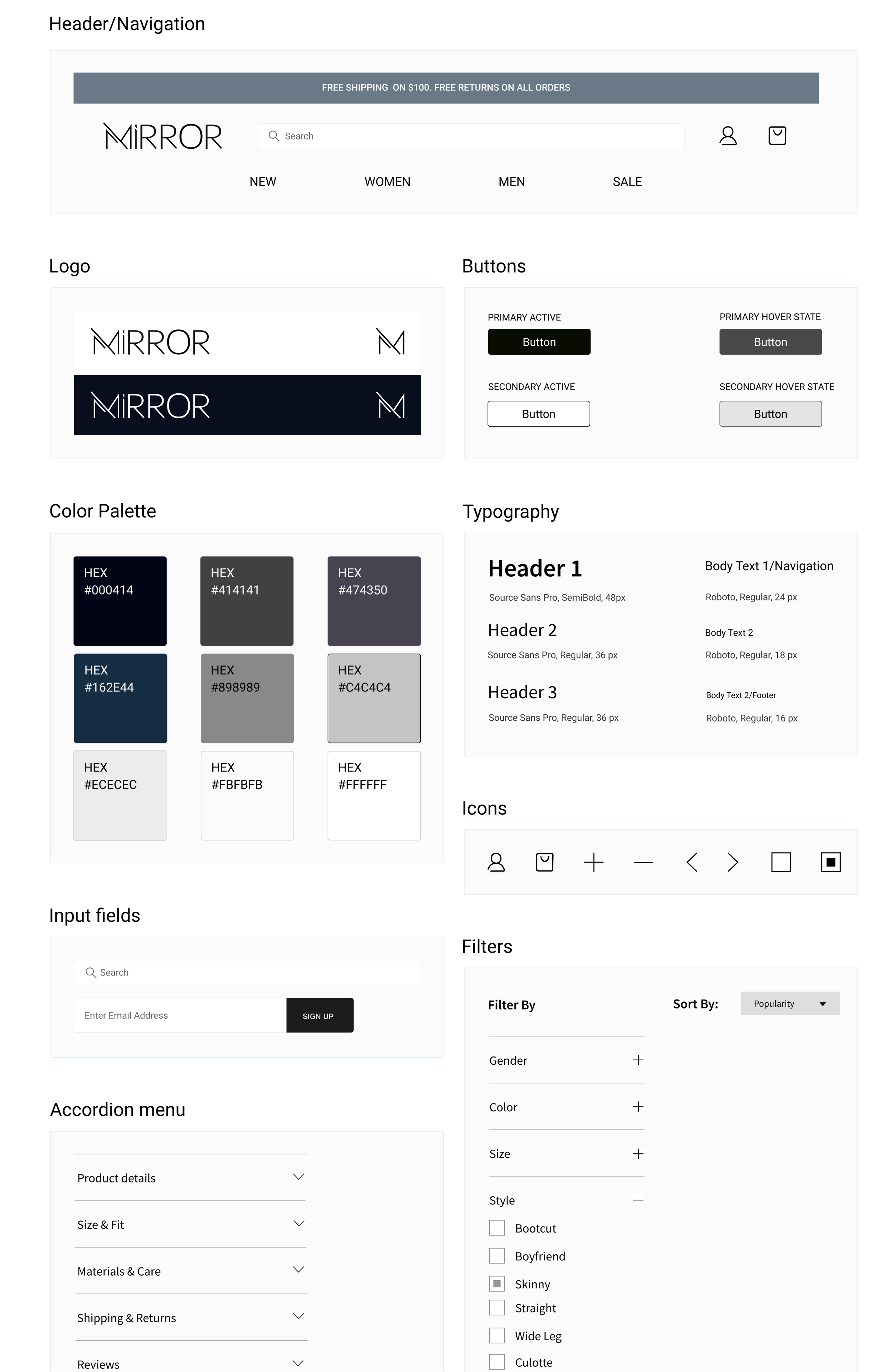
UI Kit
Based on my research and competitive analysis, I chose for Mirror calm and neutral colors. Similarly, the logo design needed to be simple and recognizable. I decided to use universal icons for the Mirror website. A user's understanding of an icon is based on previous experience. That's why it's always better to use familiar icons.

PROTOTYPE
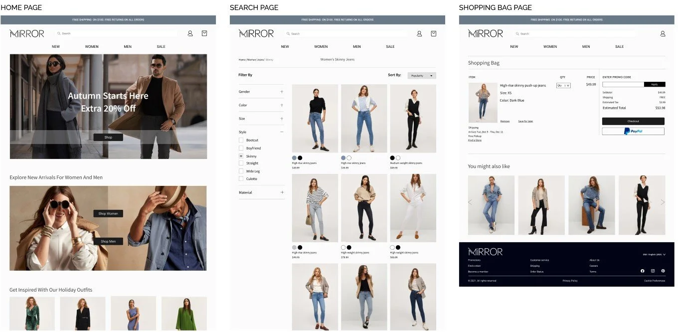
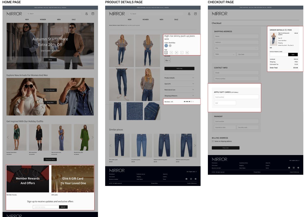
Set Of High-Fidelity Screens

USABILITY TESTING
The main task for a user is to add Skinny Jeans Size Medium to the bag and complete the checkout process.
Test Objectives:
Identify the general perception of UI design
Test the overall ease of use for the navigation panel
Test how users would prefer to complete the task of finding a specific item and purchasing
Identify pain points for users
Methodology:
In-Person: one-on-one testing using a laptop and Figma prototype
Remote: one-on-one testing with screen share and Figma prototype
Test Subject: A Mid-fidelity/High-fidelity prototype for Mirror desktop via Figma
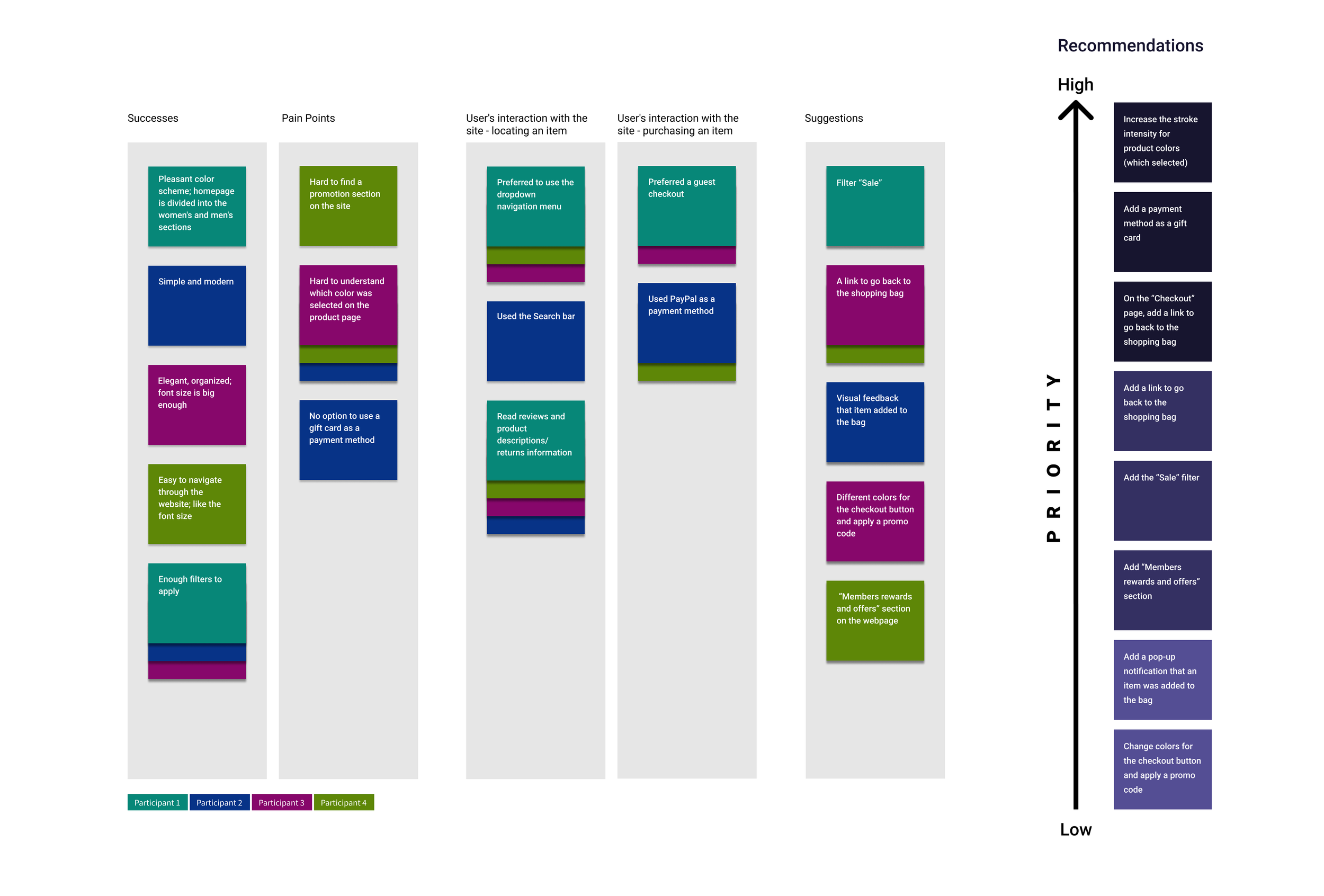
Test Findings
The usability test was conducted with four users aged 35 - 50 years old. All participants had previous experience with online shopping. Each participant was asked to complete the following task: Locate and add Skinny Jeans Size Medium to the bag and complete the checkout process.
Participants were able to complete the task given with the limitation of the prototype. They gave positive feedback about visual elements on the site and navigation system. The test showed that there are three high-priority tasks to be resolved. Some of the users' suggestions could be implemented in the future based on business needs and priorities.
Three High Priority Tasks That Have To Be Solved By:
Increase the stroke intensity for product colors (which are selected)
Add a payment method as a gift card
Redesign the checkout page
Affinity Map - Mirror

Priority Revisions
Revisions were made based on the usability test findings. The following features were added:
Homepage - Members rewards and offers/Gift Card section
Product page - increased the stroke intensity for product color and size (which selected)/Reviews section
Checkout page - changed “order details section”; added a gift card as a payment method

NEXT STEPS
Conduct additional testing using a modified prototype
See if the modifications improve the user experience
Iterate based on the feedback
Export project to developers
Conclusions
It's been a great experience working on this project. Overall, I like how the result looks like. I tried to implement all the necessary features based on my research results.
If I had to go over this project again, I would do some things in a different way. I would spend more time on the research phase. It is vital to understand our users' pain points and mental models. Based on this phase, the project could go in a different direction. Also, I would spend more time on the usability testing phase. We can explore and analyze our target audience's behavior when interacting with the product through this process. I would invite at least seven participants to conduct the usability testing. If more users are willing to provide us with feedback, the more chances that we could uncover some pattern or a particular problem.
The goal of the design process is to create an excellent product for users, and I tried to achieve it.